Wisconsin Dive Bar Shirts
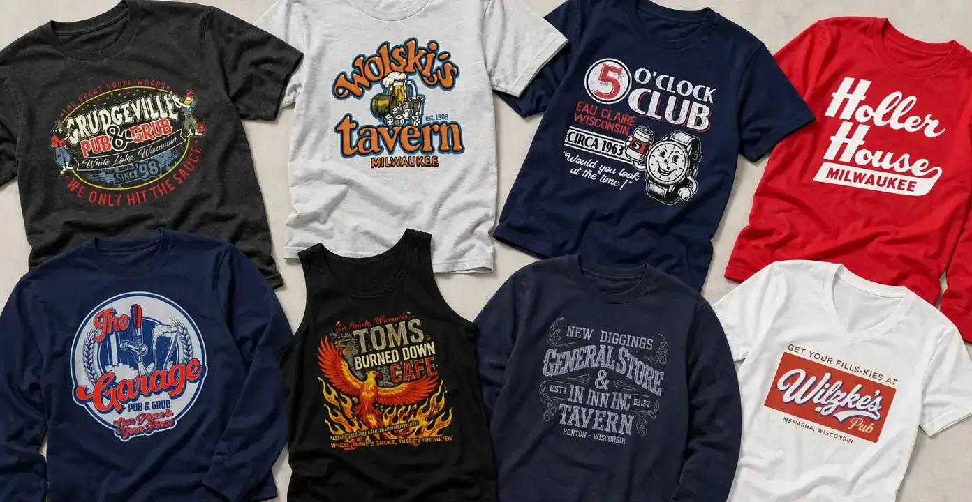
Wisconsin dive bar shirts turn the names and visual character of local taverns, pubs, and neighborhood bars into place-specific graphics. The collection ranges from clean Milwaukee wordmarks and old-sign lettering to colorful designs built around beer glasses, clocks, taps, flames, and barroom mascots, giving each establishment a distinct identity rather than relying on a generic drinking slogan.

Wisconsin Dive Bars
Wisconsin Dive Bars
Wisconsin Dive Bars
Wisconsin Dive Bars
Wisconsin Dive Bars

Wisconsin Dive Bars

Wisconsin Dive Bars
Wisconsin Dive Bars
Wisconsin Dive Bars
Wisconsin Dive Bars
Wisconsin Dive Bars
Wisconsin Dive Bars
Local tavern identity in graphic form
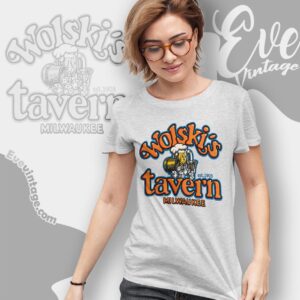
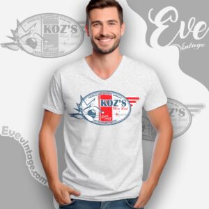
The defining feature of these Wisconsin dive bar shirts is specificity. Venue names lead the composition, often accompanied by a city, state, founding-style detail, or short house phrase. That structure gives the designs the character of a bar sign, staff shirt, or keepsake picked up during a memorable stop. The observed scope includes Milwaukee taverns such as Wolski’s Tavern and Holler House alongside bars and pubs associated with Eau Claire, Oconto, Menasha, Kenosha, and other Wisconsin communities.
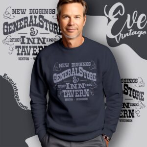
The terminology shifts with the personality of each establishment. Tavern often appears in traditional scripts or sturdy block lettering, while pub & grub supports a busier restaurant-and-bar emblem. Names such as New Diggings General Store & Tavern add a small-town storefront feeling, while The Port of Kenosha Beverage House uses another familiar type of neighborhood-bar naming. Together, these labels show how Wisconsin bar graphics can evoke different kinds of local gathering places without reducing them to one visual formula.
From simple wordmarks to illustrated bar emblems
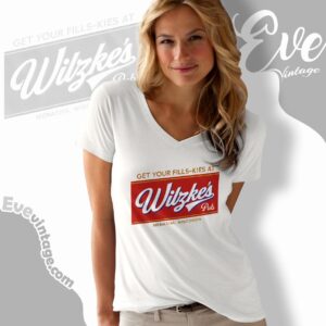
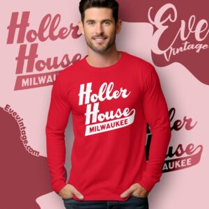
Some designs are deliberately restrained. Holler House uses a bold script-and-block treatment that reads quickly, while Wilzke’s Pub resembles a compact vintage sign panel. These cleaner compositions suit someone who prefers recognizable local lettering over an elaborate scene.
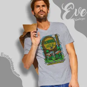
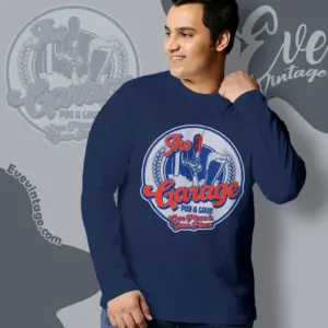
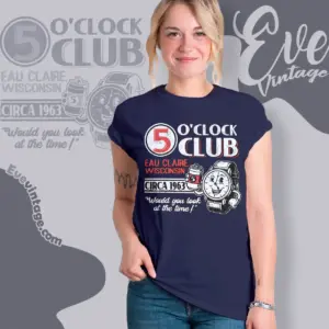
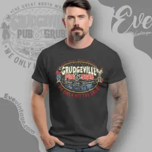
Other graphics build a fuller identity through illustration. The Five O’Clock Club design pairs its name with a smiling clock character. The Garage Pub & Grub uses a tap, beer glasses, grain, and a circular badge layout. Grudgeville combines Western-style lettering with cartoon figures and a multicolor saloon-like composition. Tom’s Burned Down Cafe takes the most dramatic route, using a phoenix, flames, and dense decorative type.
Choosing a Wisconsin bar-shirt style
For an understated look, focus on large venue lettering, limited colors, and minimal supporting art. Sign-inspired scripts and faded block type create a retro tavern feel without dominating the shirt. For a more expressive graphic, look for illustrated mascots, drink imagery, fiery motifs, or layered badge compositions.
Color changes the effect as much as the artwork. White lettering on red feels direct and high-contrast; gray ink on navy produces a quieter, worn-in appearance; orange, blue, and cream suggest vintage commercial signage. The common thread is a named Wisconsin establishment presented as the central graphic, preserving the local personality that separates a dive-bar shirt from general beer-themed apparel.