Illinois Dive Bar Shirts
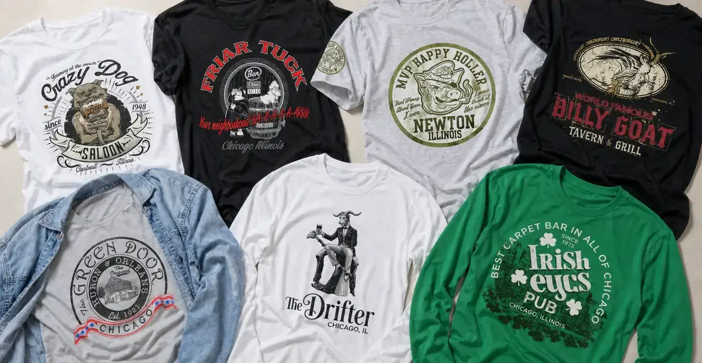
Illinois dive bar shirts translate neighborhood tavern identity into distressed emblems, bold pub lettering, illustrated mascots, and old-signage compositions. Chicago bars form a strong part of the collection, while other designs draw on the visual language of small-town saloons and local gathering places across the state. The selection ranges from restrained circular crests to character-driven graphics styled with the worn texture of an aged bar logo.
Illinois Dive Bars
Illinois Dive Bars
Illinois Dive Bars
Illinois Dive Bars
Illinois Dive Bars
Illinois Dive Bars
Illinois Dive Bars
Illinois Dive Bars
Illinois Dive Bars
Illinois Dive Bars
Illinois Dive Bars
Illinois Dive Bars
Illinois Dive Bars
Illinois Dive Bars
Illinois Dive Bars
Illinois Bar and Tavern Graphics
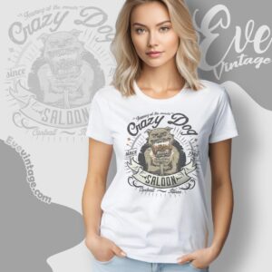
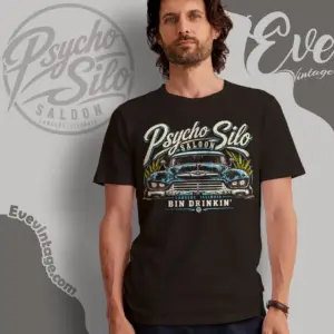
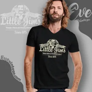
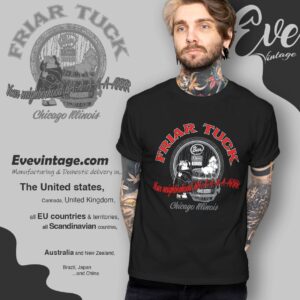
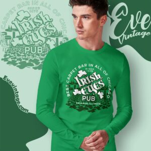
Illinois dive bar shirts do not follow one uniform visual formula. Some Chicago tavern designs emphasize a recognizable establishment name in oversized type, while pub graphics may use a compact crest, traditional script, or a limited green-and-white palette. Saloon and neighborhood-bar treatments can feature banners, illustrated mascots, and heavier lettering. These elements give each graphic a distinct identity before every line of text is read.
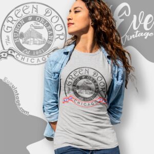
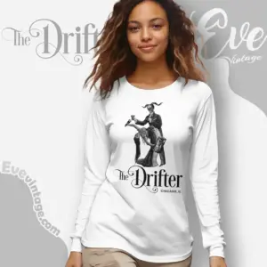
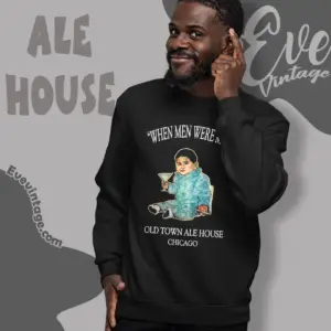
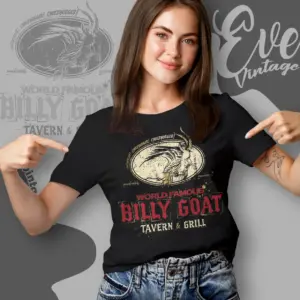
Chicago is the strongest recurring location in the observed selection, with designs featuring names such as The Drifter, Billy Goat Tavern, The Green Door Tavern, Irish Eyes Pub, and Old Town Ale House. Other graphics represent Illinois bar themes beyond Chicago, adding small-community names and local-emblem treatments to the assortment. Together, these designs cover tavern, pub, saloon, and neighborhood-bar identities without relying on a single style.
Badges, Mascots, and Lettering
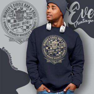
A useful distinction is between emblem-led and illustration-led designs. Emblem graphics arrange the venue name, location text, and a central symbol inside a circle, shield, or ribbon structure. Their balanced layouts place the lettering at the center of the design and recall the appearance of painted signs and vintage-style logos.
Illustration-led shirts build their identity around a mascot, character, or venue-specific symbol. Goats, dogs, fish, and theatrical figures create an immediate visual focus, while architectural emblems can make a building or entrance the central feature. Some compositions combine both approaches by placing a detailed illustration inside a distressed seal surrounded by curved lettering.
Choosing a Graphic Direction
- Classic tavern marks: Circular badges, subdued colors, serif lettering, and compact layouts offer an understated appearance.
- Bold mascot graphics: Large animals or characters make the artwork more illustrative and visually prominent.
- Irish pub graphics: Script lettering, shamrocks, green palettes, and stacked type distinguish this theme.
- Distressed sign styles: Faded ink, rough edges, and limited-color printing create an intentionally aged effect.
Color influences the overall emphasis as much as the subject. Black provides strong contrast for cream and red lettering, gray gives circular emblems a neutral ground, and brighter green draws attention to Irish pub symbolism. The best direction depends on whether the priority is the establishment name, a prominent mascot, or the texture and typography of vintage-style bar signage.