South Carolina Dive Bar Shirts
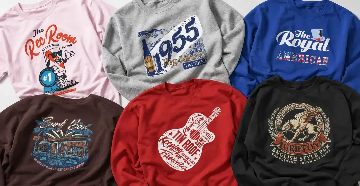
South Carolina dive bar shirts translate local taverns, pubs, and neighborhood hangouts into venue-centered graphics. Charleston names lead much of the observed mix, joined by Folly Beach coastal imagery and Clemson bar culture. The designs range from distressed dates and retro script to illustrated buildings, comic mascots, music-inspired lettering, and heraldic pub emblems, giving each establishment a distinct visual identity.
South Carolina Dive Bars
South Carolina Dive Bars
South Carolina Dive Bars
South Carolina Dive Bars
South Carolina Dive Bars

South Carolina Dive Bars
South Carolina Dive Bars
Local bar graphics from Charleston to Clemson
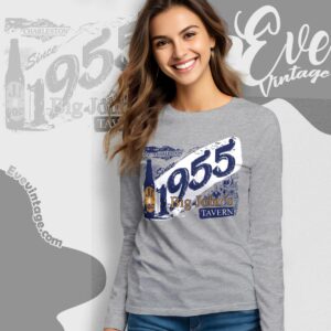
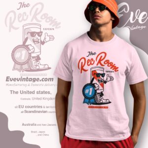
This category is organized around named South Carolina drinking spots rather than a single statewide aesthetic. Charleston-area designs often emphasize the establishment itself through prominent wordmarks, city labels, or a recognizable graphic device. The Rec Room treatment uses playful script and a cartoon beverage character, while Royal American takes a cleaner red, white, and blue approach. Big John’s Tavern leans into distressed numerals and layered lettering, creating the look of a timeworn sign or commemorative bar graphic.
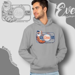
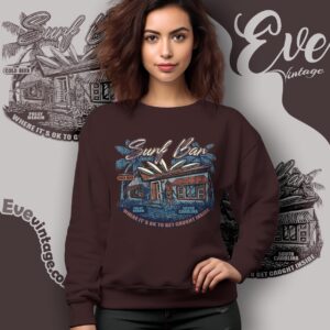
The geographic range also changes the visual language. A Folly Beach design can draw on palms, a low-slung bar building, cold-beer lettering, and warm coastal colors. Clemson representation broadens the subject beyond the Lowcountry, connecting the category to another South Carolina community with its own familiar gathering places, much as North Carolina Dive Bars reflect another nearby state's local bar culture. These locations matter because a dive bar shirt usually works as a marker of place as much as a bar logo.
Retro tavern marks, pub crests, and illustrated venues
Several distinct design directions appear within South Carolina bar shirts. Typography-led graphics keep attention on a venue name through script, block lettering, dates, or intentionally weathered printing. They resemble old exterior signs, matchbooks, or event posters without requiring a detailed scene. Illustrated venue designs add architectural features, palms, drinks, or small environmental details that establish a stronger sense of setting.
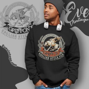
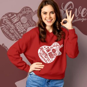
Other graphics borrow from different bar traditions. Character art gives a neighborhood tavern a humorous, informal personality. A heraldic composition—with an animal figure, wreath, banners, and serif lettering—creates the denser appearance associated with a traditional pub emblem. Music-oriented layouts may build a venue name from instruments, performance terms, and decorative lettering. These approaches are visually different even when the establishments share the broad dive bar category.
Choosing a South Carolina dive bar design
The clearest distinction is between place-first and art-first graphics. Place-first designs prominently identify Charleston, Folly Beach, Clemson, or South Carolina and suit people who recognize the local connection immediately. Art-first designs make the mascot, crest, building, or oversized lettering the focal point, with the location acting as supporting detail.
Color and composition further shape the effect. Limited red, white, and blue palettes can feel crisp and sign-like; muted coastal colors support weathered beach-bar scenes; dark grounds give ornate pub imagery greater contrast. Across these variations, the defining thread is a specific South Carolina establishment expressed through the visual language of neighborhood bars, taverns, beach hangouts, and pubs.