Nevada Dive Bar Shirts
Nevada dive bar shirts turn local tavern identity into graphics shaped by Las Vegas nightlife, Reno roadside culture, and Virginia City saloon imagery. The observed designs range from spare bottle-and-badge emblems to Western lettering, animal mascots, highway shields, and unruly illustrated characters, capturing several sides of Nevada barroom style without reducing the category to a single vintage look.
Nevada Dive Bars
Nevada Dive Bars
Nevada Dive Bars
Nevada Dive Bars

Nevada Dive Bars
Nevada Dive Bars
Nevada Dive Bars
Nevada Dive Bars
Nevada barroom graphics beyond the casino strip
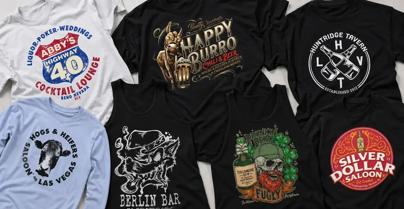
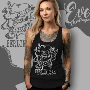
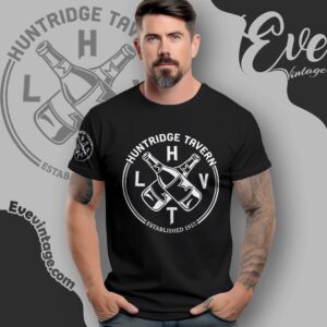
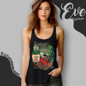
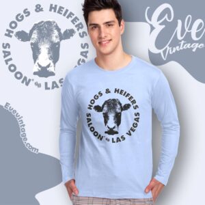
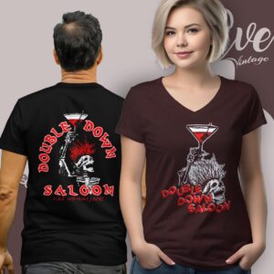
Nevada dive bar shirts draw on venue identity rather than polished resort imagery. In the sampled Las Vegas designs, that can mean a compact neighborhood-tavern emblem, crossed bottles, a stark livestock portrait, or a deliberately unruly barroom character. The common thread is directness: names, symbols, and bold compositions that resemble signs, patches, stickers, or familiar venue marks rather than destination advertising.
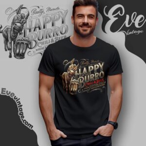
This gives Las Vegas bar tees several distinct moods. A circular black-and-white mark feels restrained and familiar, while an oversized illustrated figure creates a louder, more irreverent impression. Animal imagery adds another route, ranging from a plain cattle head to a humorous mascot carrying a drink. These differences matter more than a generic “vintage” label because they determine whether the design looks like a traditional tavern insignia, a novelty illustration, or a piece of nightlife artwork.
Roadside and northern Nevada influences
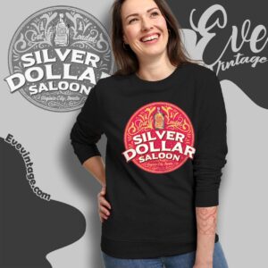
The category also reaches beyond Las Vegas through Reno, Virginia City, and other Nevada venue references. Highway-shield compositions connect a bar name with roadside travel through stacked lettering and a route-sign silhouette. Saloon graphics take a different approach: ornate scripts, decorative borders, bottle imagery, and bright label-like color combinations recall Western signs and vintage packaging.
Northern Nevada bar shirts can therefore feel more road-worn or saloon-oriented without all looking alike. A distressed red, white, and blue highway badge has the clarity of an old roadside sign. A bright circular saloon crest feels closer to decorative packaging. Both rely on place names and familiar graphic forms, but they express different kinds of local character.
Choosing a graphic direction
- Minimal venue marks: High-contrast type, bottles, initials, or a single animal image keep the focus on the bar name.
- Roadside badges: Route shields and stacked location text emphasize travel, neighborhood, and highway associations.
- Western saloon designs: Ornamental lettering, scrollwork, and label-style frames create a more traditional Nevada tavern appearance.
- Character illustrations: Burros, cattle, and exaggerated barroom personalities make the artwork more narrative and visually dense.
Together, these approaches define Nevada dive bar apparel through local names and recognizable bar-sign language. The strongest distinction is not simply old versus new, but emblematic versus illustrative: one resembles a compact house mark, while the other turns a venue identity into a fuller graphic scene.