New York Dive Bar Shirts
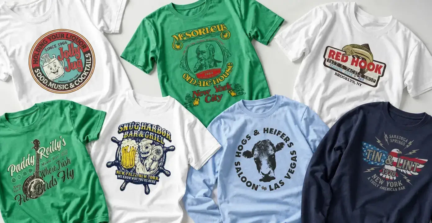
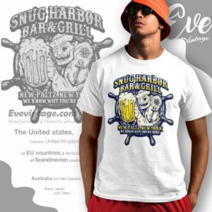
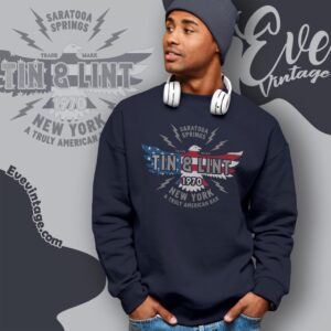
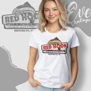
New York dive bar shirts draw on the identities of neighborhood taverns, Irish pubs, music bars, and unpolished local institutions from Manhattan and Brooklyn to upstate communities. The graphics favor the visual language of well-worn bar merchandise: arched lettering, illustrated emblems, location names, establishment dates, and limited-color prints that can resemble an old staff shirt, souvenir tee, or back-bar sign.

New York Dive Bars

New York Dive Bars
New York Dive Bars
New York Dive Bars
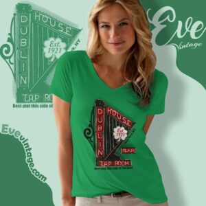
New York Dive Bars
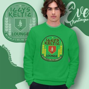
New York Dive Bars
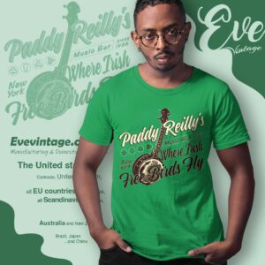
New York Dive Bars
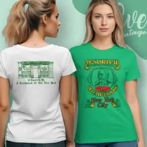
New York Dive Bars
New York Dive Bars
New York Dive Bars
New York Dive Bars
Nevada Dive Bars
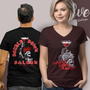
Nevada Dive Bars
Neighborhood Bars as Graphic Identity
A New York dive bar shirt usually works less like a polished hospitality logo and more like a piece of neighborhood ephemera. A venue name may be paired with a borough, street-level identity, founding date, house slogan, or familiar emblem. Those details can give the composition the character of a back-bar sign, matchbook graphic, or shirt made for regulars and staff.
New York City supplies several distinct versions of that language. McSorley’s Old Ale House brings an old-tavern character rooted in its East Village identity and 1854 establishment date. Dublin House represents the longstanding neighborhood-bar tradition of the Upper West Side, while Iggy’s Keltic Lounge connects Lower East Side dive culture with rock-and-roll energy. Brooklyn references include Irish Haven, a longstanding Sunset Park dive bar. These subjects are related, but they do not all represent the same kind of room: historic ale house, Irish pub, music bar, and neighborhood dive each suggest a different visual direction.
From Pub Signs to Music-Bar Graphics
Irish pub-inspired designs can emphasize script lettering, crests, circular seals, and other cues associated with traditional pub signage. Music-bar graphics shift the focus toward guitars, portraits, performance imagery, and bolder poster-like type. Tavern and saloon treatments often center on condensed lettering, mascots, slogans, or establishment dates. Nautical imagery—such as anchors, ship wheels, fish, and harbor wording—creates another recognizable branch when a design emphasizes a waterfront identity.
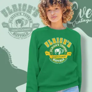
The category also extends beyond the five boroughs. Upstate-oriented graphics may foreground a town name or regional identity rather than an NYC neighborhood, much as New Jersey Dive Bars use state and local identity to frame their designs. This distinction matters when choosing a design: some shirts read immediately as Manhattan or Brooklyn bar references, while others resemble local tavern graphics associated with another New York community.
Choosing a Visual Direction
Look first at the balance between venue identity and illustration. Type-led designs keep the bar name and location dominant, giving the shirt the feel of a classic venue tee. Emblem-led compositions use mascots, beverage imagery, instruments, portraits, or nautical symbols as the focal point. Arched type and script can evoke painted signage, while crests, dates, slogans, and limited-color compositions create a more traditional bar-merchandise look.
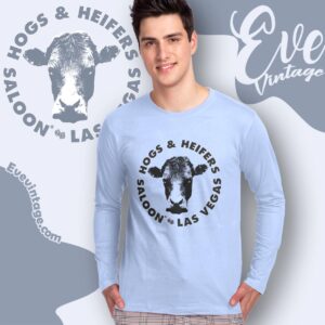
Location text is especially useful in this category because similarly named bars can exist in different cities and states. Reading the borough, town, or state line as part of the artwork helps distinguish a New York reference from an unrelated venue elsewhere.