Ohio Dive Bar Shirts
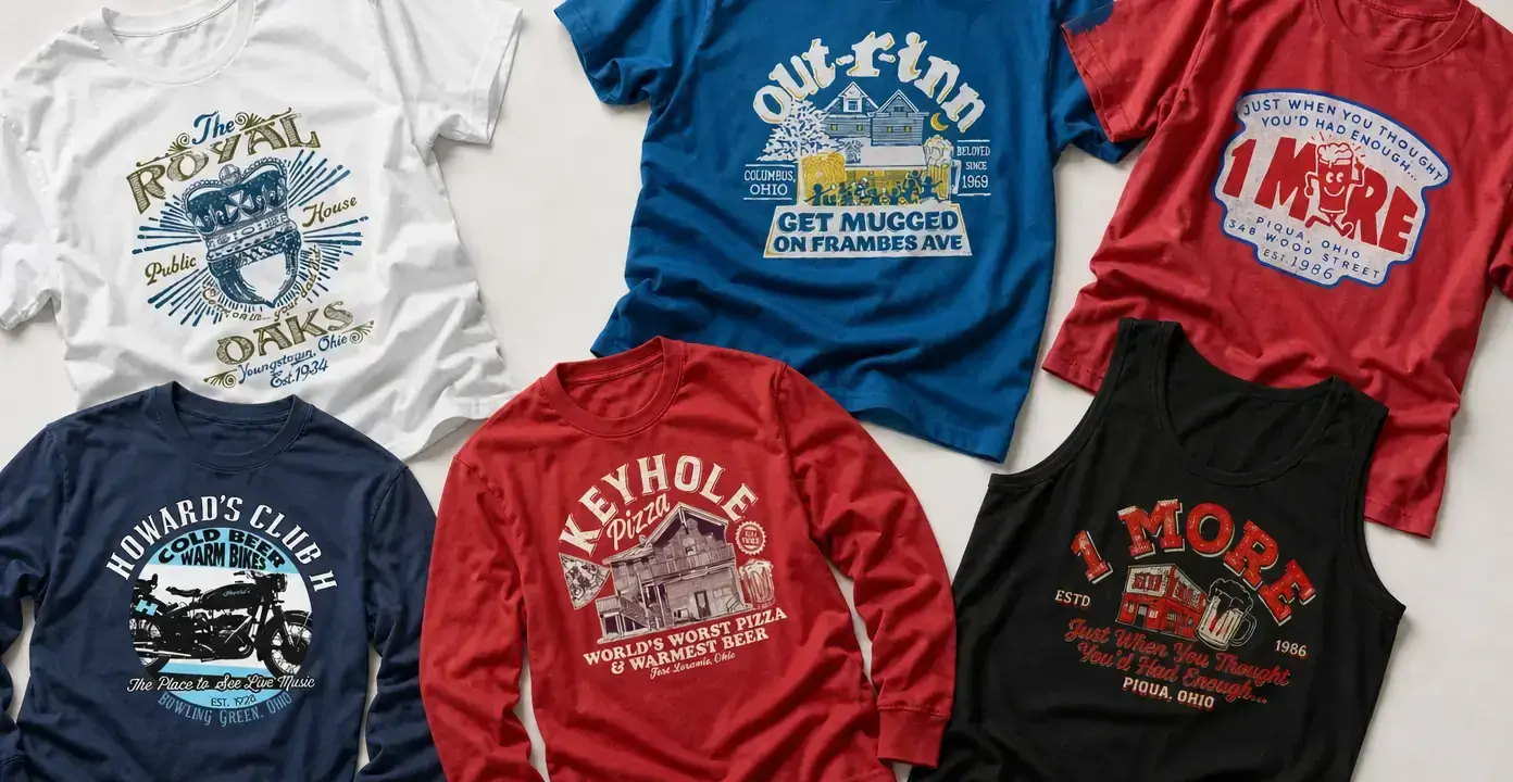
Ohio dive bar shirts turn neighborhood bar names, local slogans, and familiar sign-style graphics into wearable pieces of state culture. The collection spans Columbus, Cleveland, Youngstown, Bowling Green, Piqua, and other Ohio references, with artwork ranging from distressed wordmarks and pub crests to illustrated buildings, music-venue motifs, beer humor, and pizza-bar graphics.
Ohio Dive Bars
Ohio Dive Bars

Ohio Dive Bars

Ohio Dive Bars

Ohio Dive Bars

Ohio Dive Bars
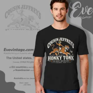
Ohio Dive Bars
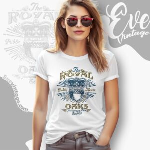
Ohio Dive Bars
Local bar graphics from across Ohio
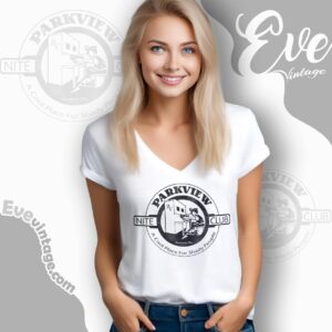
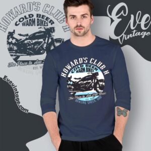
Ohio dive bar shirts are defined as much by place as by the bar name itself. The observed collection connects Out-R-Inn and Char-Bar with Columbus, Parkview Nite Club with Cleveland, Royal Oaks with Youngstown, and Howard’s Club H with Bowling Green. A 1 More Bar design identifies Piqua, adding a smaller-city reference to the mix. Together, these graphics present Ohio bar culture through individual establishments, with a distinct local focus that also separates them from nearby Ohio tiki bar shirts rather than a single statewide symbol.
That geographic range creates different kinds of local recognition. A Columbus street reference can read like an inside joke to regulars, while a city-and-state line beneath a crest resembles the location copy on an old tavern sign. These details give each design a specific hometown identity without requiring the artwork to resemble a conventional Ohio souvenir.
From pub crests to humorous bar slogans
The strongest visual distinction is between emblem-based designs and illustrated scenes. Royal Oaks uses ornate lettering, a crown, and radiating lines to create a formal public-house crest. Out-R-Inn combines a building illustration with large curved type and a prominent slogan, producing the denser look of a vintage bar advertisement. The 1 More Bar graphics lean into wordplay, beer-mug imagery, bold numerals, and compact sign-like layouts.
Howard’s Club H introduces another direction: live-music language paired with motorcycle imagery and strong arched lettering. That combination gives the graphic the feel of a venue shirt rather than a simple bar logo. Keyhole Pizza adds a food-and-bar crossover, using an illustrated building, pizza references, and beer language in a composition reminiscent of a neighborhood restaurant sign.
Choosing a graphic direction
For a cleaner local-bar look, focus on large names, crests, and centered badges that remain readable from a distance. Designs with storefronts, buildings, street references, or several lines of copy carry more narrative detail and reward a closer look. Distressed textures and limited-color palettes reinforce the appearance of aged signage, while brighter contrasts make slogans and illustrated motifs more prominent.
The most meaningful choice may be the relationship behind the design: a remembered Columbus stop, a Cleveland neighborhood reference, a Youngstown bar connection, a Bowling Green music connection, or a Piqua bar joke. That local specificity is what separates Ohio dive bar tees from generic beer shirts.