Oregon Dive Bar Shirts
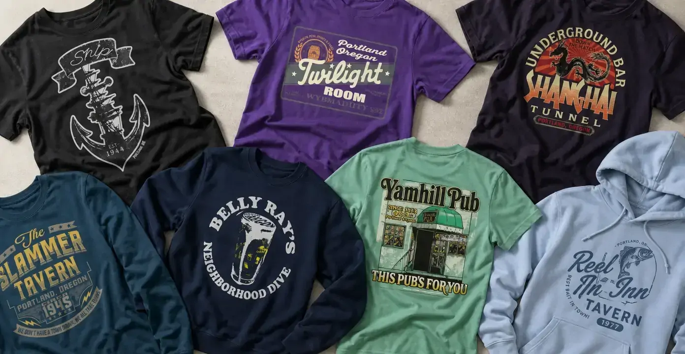
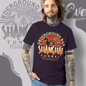
Oregon dive bar shirts turn tavern names, neighborhood pub identities, and Portland references into sign-inspired graphics. The observed designs range from compact crests and old-fashioned wordmarks to storefront scenes, nautical emblems, and a bold underground-bar illustration, giving the category a distinctly local focus without reducing every venue to the same distressed vintage treatment.
Oregon Dive Bars
Oregon Dive Bars
Oregon Dive Bars
Oregon Dive Bars
Oregon Dive Bars
Oregon Dive Bars
Oregon Dive Bars
Oregon Dive Bars
Portland bar identity in graphic form
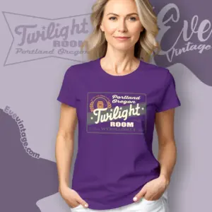
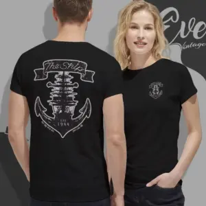
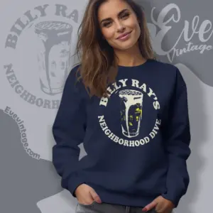
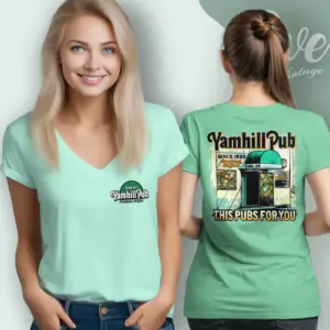
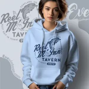
Portland is the strongest city cue in this collection, with venue names such as The Ship Tavern, Yamhill Pub, Billy Ray’s Tavern, Twilight Room, The Slammer Tavern, Shanghai Tunnel, and Reel M Inn anchoring the designs. Rather than depicting a generalized nightlife theme, the graphics treat each bar name as a visual identity. Location lines, framed lettering, motto-like details, and badge shapes give the artwork the structure of signs, decals, or staff-shirt emblems.
Typography carries much of that character. Sweeping scripts can suggest a painted window or illuminated sign, while condensed capitals and heavy slab lettering create the directness of an old tavern mark. Distressed edges and limited-color printing add wear without making every design visually identical. Some compositions are orderly and symmetrical; others resemble a lively handbill or poster.
Nautical marks, neighborhood scenes, and underground themes
Nautical imagery forms one clear design direction. The Ship Tavern graphic places an anchor inside a crest-like arrangement, while Reel M Inn combines a fish, line, and flowing script. Both connect a tavern name with maritime or angling symbols, but one is compact and emblematic while the other is more open and illustrative.
Neighborhood-pub designs use more familiar street-level cues. Yamhill Pub features a detailed entrance scene, turning the façade into part of the venue identity. Billy Ray’s Tavern instead uses drinkware and a circular word arrangement for a bolder, simpler mark. These approaches emphasize the visual language of a local bar—its name, doorway, glassware, and neighborhood wording—rather than a broad Oregon landscape.
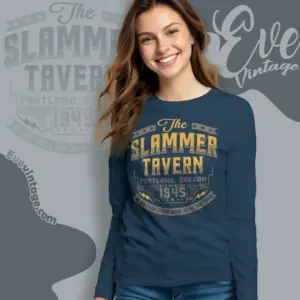
Other graphics move toward dramatic storytelling. Shanghai Tunnel pairs large underground-bar lettering with a dragon illustration and layered colors, producing a poster-like result. Twilight Room and The Slammer Tavern depend more strongly on typography, framed panels, stars, and sign-style hierarchy.
Choosing a graphic direction
The main distinction is how visibly the artwork announces itself. A small crest or restrained wordmark offers a quieter venue reference. Storefront artwork rewards closer viewing, while large block type reads clearly from a distance. Fish, anchors, dragons, and drink illustrations place the theme front and center. Across these directions, Oregon dive bar apparel is unified by venue-centered design rather than one fixed version of “vintage” style.