Washington Dive Bar Shirts
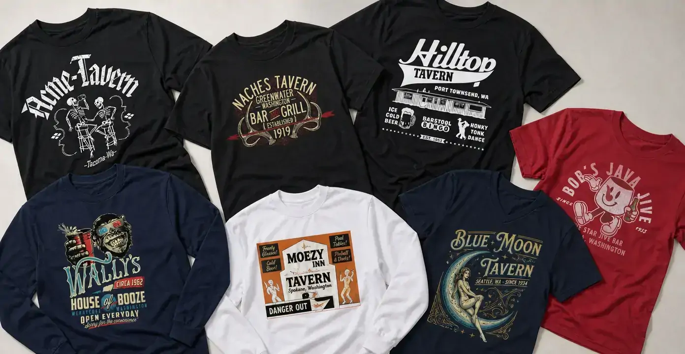
Washington dive bar shirts draw on tavern signs, neighborhood bar emblems, and character-driven graphics tied to places across the state. The collection spans Seattle and Tacoma references, small-town saloon imagery, and designs shaped by barroom staples such as pool, bingo, cold beer, dancing, and late-night humor, with styles ranging from restrained vintage lettering to colorful illustrated mascots.
Washington Dive Bars
Washington Dive Bars
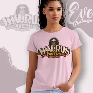
Washington Dive Bars
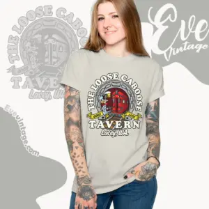
Washington Dive Bars
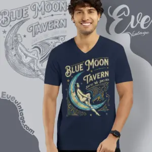
Washington Dive Bars
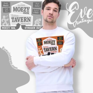
Washington Dive Bars
Washington Dive Bars
Washington Dive Bars
Washington Dive Bars
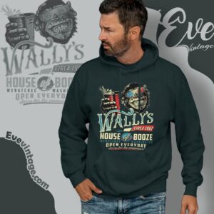
Wally’s House of Booze Shirt – Wenatchee Washington Dive Bar Tee
Washington Dive Bars
Washington Dive Bars
Washington Dive Bars
Washington tavern graphics with a local point of view
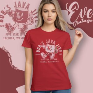
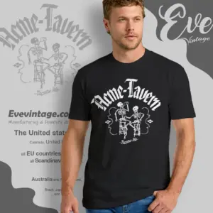
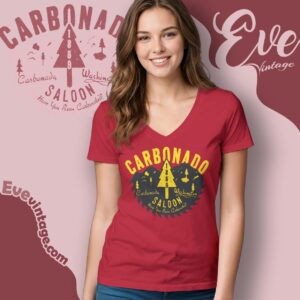
This category is organized around the visual identity of Washington watering holes rather than one universal dive-bar look. Some designs name established city venues: Acme Tavern and Bob’s Java Jive connect to Tacoma, while Blue Moon Tavern connects to Seattle. Carbonado Saloon adds a small-town Washington reference. Together, these subjects give the collection a geographic range extending beyond a single nightlife district or city stereotype.
The venue language is equally varied. “Tavern,” “saloon,” “inn,” and more irreverent bar names each suggest a different graphic direction. Tavern designs often resemble painted storefront signs or printed matchbook emblems. Saloon treatments lean toward arched lettering, mountain silhouettes, trees, or badge-like compositions. More playful bar identities use mascots, exaggerated characters, and slogans to create the feel of a well-worn neighborhood shirt.
From sign painting to illustrated bar humor
Typography is one of the clearest ways to distinguish these Washington dive bar shirts. Ornamental scripts and decorative borders evoke old sign painting, while condensed block letters and simple two-color layouts resemble menus, window decals, or roadside advertising. Distressed printing can make either approach feel aged without requiring an elaborate illustration.
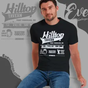
The illustrated designs move in several directions. Blue Moon Tavern artwork uses a celestial composition and flowing decorative type. Bob’s Java Jive takes a lighter mascot approach, while Acme Tavern pairs dramatic lettering with a skeletal barroom scene. Other graphics build their identities around pool tables, bingo, cold beer, dancing, or a bar-and-grill atmosphere. These details matter more than a generic “vintage” label because they determine whether a shirt reads as subdued local signage, nostalgic Americana, or rowdy drinking humor.
Reading dates and place names in the artwork
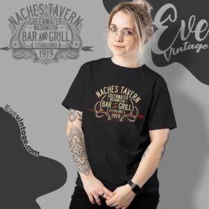
Many tavern-style graphics incorporate city names, founding dates, or “since” language as part of the composition. On this page, those printed elements should be read as features of the artwork unless independently established as venue history. That distinction is especially useful for lesser-known or difficult-to-verify names. For a location-led choice, focus on clearly identified Washington references; for a style-led choice, compare the lettering, palette, mascot, and barroom motifs without treating every decorative claim as a documented historical fact.