Louisiana Dive Bar Shirts
Louisiana dive bar shirts turn the identity of neighborhood pubs, late-night lounges, and New Orleans watering holes into wearable graphics. The designs range from weathered venue emblems and old-sign typography to architectural drawings, ships, skeletons, crowns, and playful house symbols, giving each bar a distinct visual character without reducing the collection to a single retro style.
Louisiana Dive Bars
Louisiana Dive Bars
Louisiana Dive Bars
Louisiana Dive Bars
Louisiana Dive Bars

Louisiana Dive Bars

Louisiana Dive Bars
Louisiana Dive Bars
Louisiana Dive Bars
Louisiana Dive Bars
Louisiana Bar Graphics with a Strong New Orleans Accent
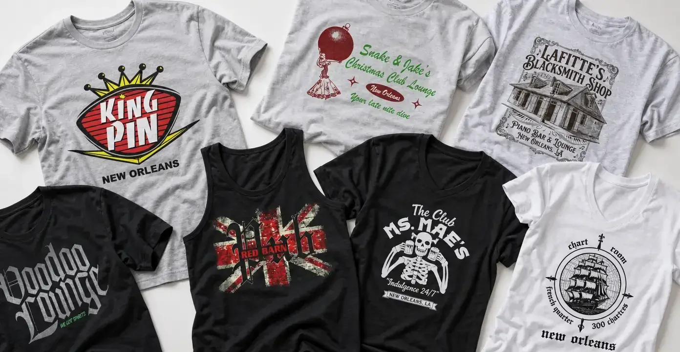
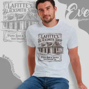
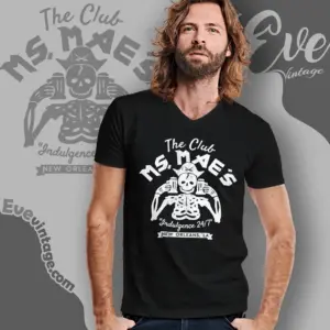
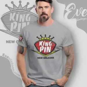
This category is organized around individual bars rather than a generic cocktail or nightlife theme. New Orleans supplies much of the observed subject matter, with designs for places such as Kingpin, The Chart Room, Club Ms. Mae’s, Snake and Jake’s Christmas Club Lounge, and Lafitte’s Blacksmith Shop. Each shirt treats the venue name as the central identity, often framing it with a house emblem or an illustration that recalls a sign, handbill, or souvenir print.
That venue-first approach creates useful distinctions within Louisiana dive bar shirts. Some graphics emphasize the name in a compact badge that reads clearly from a distance. Others build a scene around the establishment, using a façade or symbolic image to suggest more of its individual atmosphere. The result is local bar apparel with more specificity than a general New Orleans nightlife design.
From Architectural Drawings to Bold House Emblems
Architectural artwork offers the most detailed direction. The Lafitte’s Blacksmith Shop graphic, for example, places a line drawing of the building inside an ornamental frame, with serif lettering that resembles an engraved placard. The Chart Room takes a different illustrative route: a sailing ship sits inside a circular compass-like layout, creating a clean black-and-white composition with maritime character.
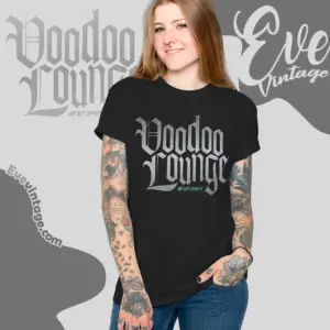
Logo-led designs rely on faster visual signals. Kingpin uses a crown, oval badge, bright accents, and large block lettering. Club Ms. Mae’s combines a skeleton illustration with irregular white type on black fabric, while Snake and Jake’s uses holiday colors and an ornament character for a deliberately offbeat lounge graphic. Voodoo Lounge is more restrained, letting oversized Gothic lettering dominate the shirt. These are not interchangeable treatments; typography, symbols, and composition determine whether a design feels polished, playful, dark, or deliberately rough-edged.
Choosing a Graphic Direction
- Venue-sign style: Block lettering, badges, crowns, and limited colors create an immediate bar-logo look.
- Illustrated landmark style: Building drawings and ornamental borders suit designs with architectural detail.
- Character-driven style: Skeletons, ornaments, and other mascots give a neighborhood lounge graphic more humor.
- Minimal type style: Large Gothic or hand-drawn lettering keeps attention on the venue name.
- Distressed print style: Faded textures create the worn-in appearance of an older bar sign.
These differences make the category as much about graphic language as geography. A monochrome ship illustration, a weathered pub mark, and a colorful crown emblem can all fit the collection while conveying very different visual moods.