Wyoming Dive Bar Shirts
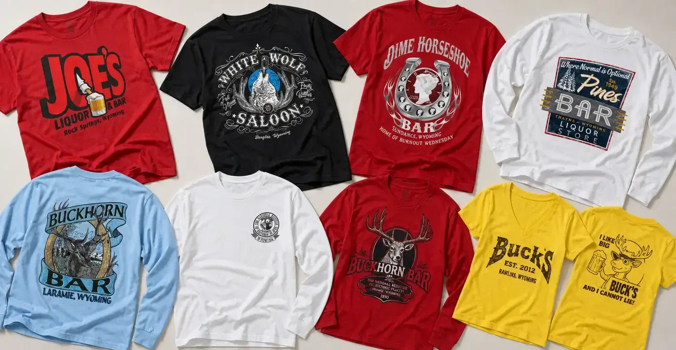
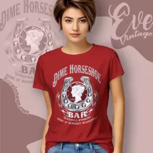
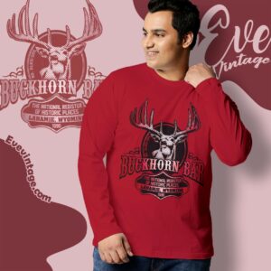
Wyoming dive bar shirts turn local establishment names and town references into graphic apparel shaped by Western lettering, wildlife emblems, horseshoes, antlers, and retro sign layouts. The collection includes designs associated with Buckhorn Bar and Parlor in Laramie, Dime Horseshoe Bar in Sundance, and White Wolf Saloon in Douglas, alongside other Wyoming bar-themed graphics ranging from detailed saloon crests to playful sports-bar logos.
Wyoming Dive Bars
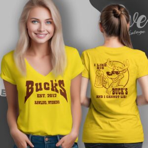
Buck’s Sports Bar and Grill Shirt – Rawlins WY Dive Bar Vibe
Wyoming Dive Bars
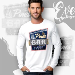
Wyoming Dive Bars
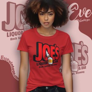
Wyoming Dive Bars
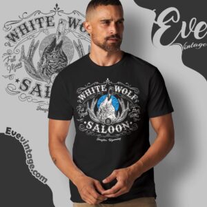
Wyoming Dive Bars
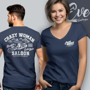
Wyoming Dive Bars
Wyoming Dive Bars
Wyoming Dive Bars
Local Bar Names as Wyoming Graphics
These Wyoming bar shirts are organized around establishments and the communities named in their designs. That local pairing is the defining feature: a bar or saloon name usually carries more visual weight when it appears with Laramie, Sundance, Douglas, Rawlins, Thayne, or Rock Springs. Some graphics resemble a venue emblem that could sit above a doorway, while others read like a souvenir from a neighborhood bar, liquor counter, or casual grill.
Among the clearest place-based subjects are Buckhorn Bar and Parlor in Laramie, Dime Horseshoe Bar in Sundance, and White Wolf Saloon in Douglas. Their designs take different routes even within the same broad Wyoming bar theme. Buckhorn graphics use antlers, a deer illustration, and Western typography; Dime Horseshoe centers a large horseshoe and coin-like device; White Wolf builds a detailed crest around a wolf, antlers, ornamental lettering, and a restrained black, white, and blue palette.
Western Emblems, Wildlife, and Roadside-Sign Style
The collection’s visual language moves between rugged illustration and familiar commercial-sign design. Horseshoes and antlers create an immediate ranch-country association, while wolves, deer, forests, and mountain-like linework give individual shirts a more outdoors-oriented identity. These motifs are best understood as graphic choices visible in the apparel—not proof of a venue’s history, décor, or traditions.
Typography creates another useful distinction. Arched slab lettering and decorative serif type lean toward a saloon look. Badges and circular seals feel more like club or heritage-style marks. Rectangular panels with contrasting borders resemble mid-century roadside signs, especially when paired with script lettering or condensed block type. Simpler logo treatments use oversized names, beer imagery, or humorous characters for a less formal sports-bar mood.
Choosing a Design Direction
- For a specific town connection: prioritize the city and state line beneath the establishment name.
- For a classic Western composition: look for horseshoes, antlers, ornate borders, and arched lettering.
- For wildlife-focused artwork: choose a large illustrated animal emblem rather than a type-dominant logo.
- For retro bar-sign character: look for framed panels, limited colors, script accents, and intentionally aged print effects.
- For a casual bar-and-grill look: bold names, beverage motifs, and humorous artwork create a more playful direction.
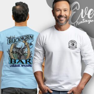
Front placement keeps the venue identity immediate, while a small chest mark paired with a larger back illustration gives the artwork more room to develop. Color also changes the effect: black supports detailed white linework, red reinforces Western poster styling, and white lets multicolor sign graphics remain crisp and readable.