Las Vegas Raiders Graphic Shirts
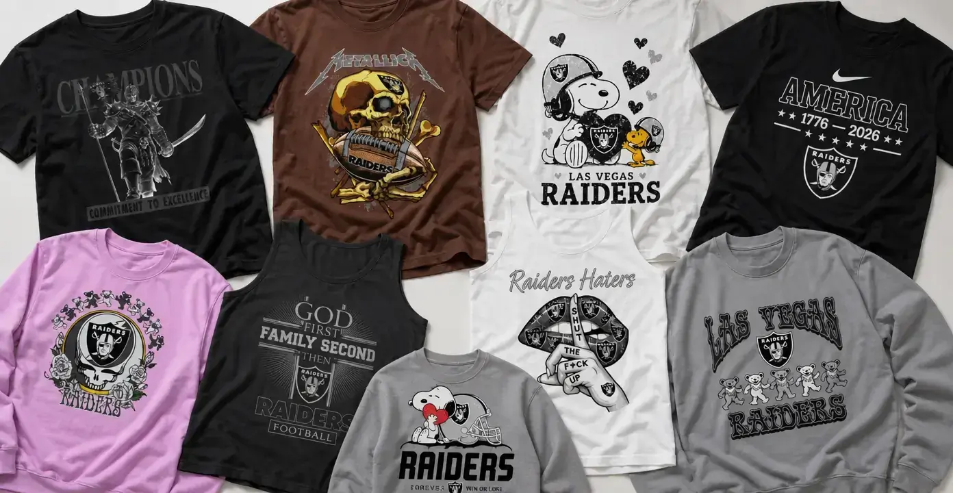
Las Vegas Raiders shirts center the Silver and Black identity in graphics ranging from shield-led football designs to skull art, defiant slogans, and playful character crossovers. The collection also reaches back to the team’s Oakland legacy, while music-inspired imagery, holiday themes, and fan-loyalty messages offer distinct alternatives to a conventional team-logo tee.
Las Vegas Raiders

Las Vegas Raiders
Las Vegas Raiders

Las Vegas Raiders

Las Vegas Raiders

Las Vegas Raiders
Las Vegas Raiders

Las Vegas Raiders

Las Vegas Raiders

Las Vegas Raiders

Las Vegas Raiders

Las Vegas Raiders

Las Vegas Raiders

Las Vegas Raiders

Las Vegas Raiders


Las Vegas Raiders

Las Vegas Raiders

Las Vegas Raiders
Silver and Black graphic directions
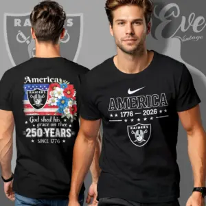
The strongest Raiders designs begin with a compact visual language: black, silver, shield shapes, helmets, footballs, and heavy athletic lettering. Some keep those elements clean and prominent, while others push them into darker territory with skulls, armored figures, distressed textures, or confrontational fan slogans. That difference matters when choosing between a straightforward football shirt and a graphic that emphasizes the Raiders’ rebellious, hard-edged persona.
Typography changes the tone as much as the central image. Block capitals and stacked layouts create a bold sports-graphic look; gothic lettering, metallic outlines, and worn finishes feel heavier. Loyalty statements place fan identity ahead of a specific player, game, or season, giving the artwork a more enduring focus.
Las Vegas identity and Oakland legacy
Current Las Vegas Raiders shirts and Oakland-themed designs represent related but distinct directions. Las Vegas graphics foreground the present team name and familiar Silver and Black imagery. Oakland references work as legacy designs, often pairing the Raiders name with retro helmets, vintage-style type, or long-term loyalty messages. Fans looking for an old-school treatment can focus on those place-name and styling cues rather than assuming every distressed print is an Oakland design.
Music, characters, and seasonal crossovers
Crossover artwork broadens the collection beyond conventional football compositions. Music-inspired shirts use dancing bears, roses, skull emblems, psychedelic framing, or sharp heavy-metal lettering to merge fan imagery with concert-poster aesthetics. These designs generally feel busier and more illustrative than a shield-centered tee, with the reference carried through visual motifs rather than a plain team wordmark.
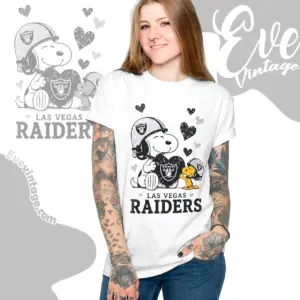
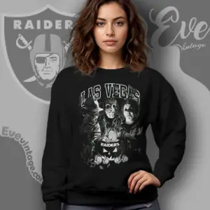
Character-based concepts take a lighter approach. Snoopy and Charlie Brown scenes can frame Raiders loyalty through humor or affection, while other observed designs draw on cute-character styling, armored science-fiction imagery, horror, or an irritable holiday character. Seasonal options apply the same team identity to Christmas and Halloween themes through festive scenes, costumes, or darker novelty graphics.
Choosing the visual emphasis
- Classic football: shields, helmets, footballs, team colors, and bold athletic type.
- Legacy: Oakland wording, retro treatments, and enduring loyalty statements.
- Hard-edged: skulls, armored figures, distressed finishes, and blunt fan language.
- Crossover: music-poster imagery, familiar character styles, and genre references.
- Seasonal: Christmas and Halloween artwork.
Because some slogan designs use explicit wording, the text is worth checking as closely as the illustration. Color also changes the effect: black, silver, gray, and white preserve the familiar monochrome mood, while brighter or contrasting garments make crossover artwork more playful and prominent.