Chicago Bears Graphic Shirts
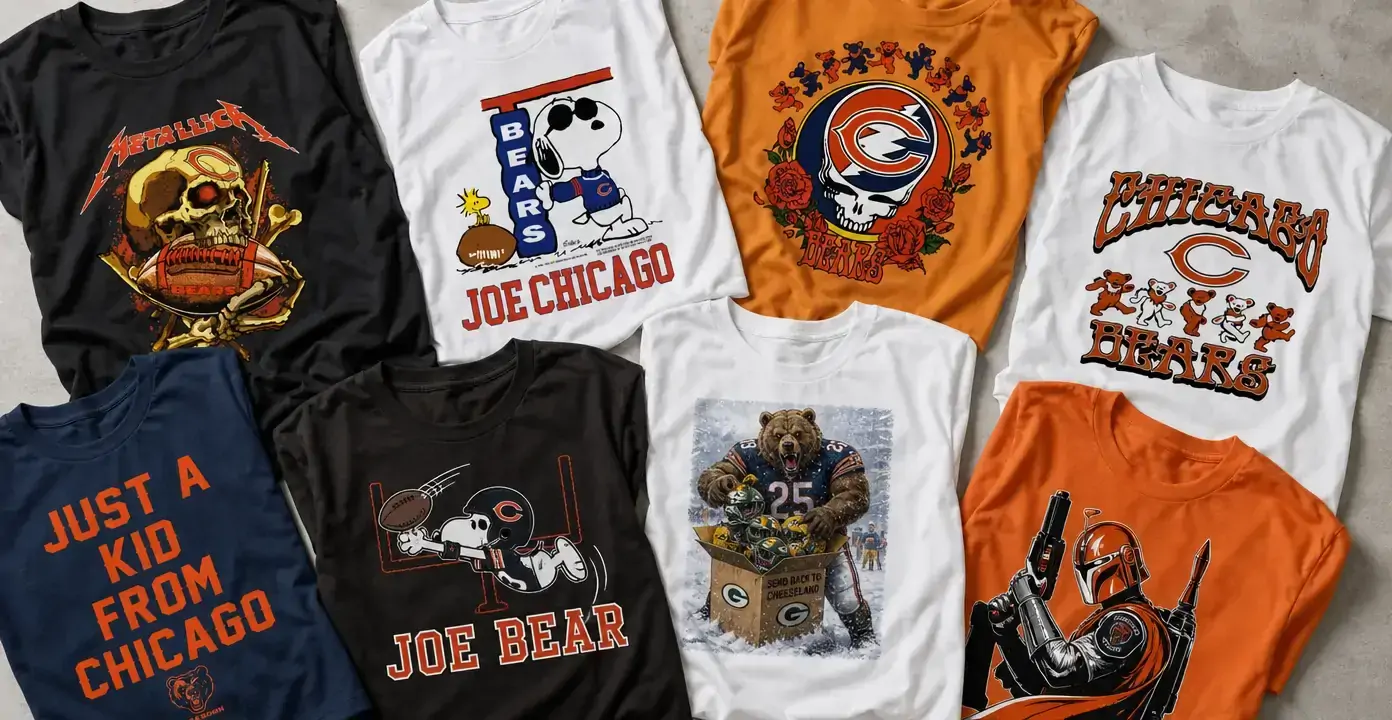
Chicago Bears graphic shirts pair the team’s navy-and-orange identity with bear imagery, Chicago pride, and football-centered slogans. The collection ranges from straightforward wordmarks and mascot graphics to humorous rivalry scenes, vintage-style character art, and music, horror, science-fiction, or holiday crossovers. These different treatments offer a choice between recognizable Bears colors and symbols or a more playful design built around another interest.
Chicago Bears
Chicago Bears

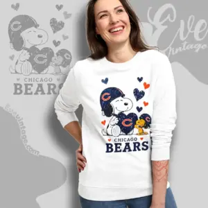
Chicago Bears
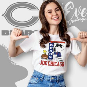
Chicago Bears
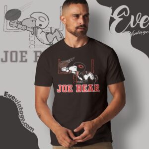
Chicago Bears
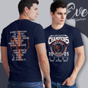
Chicago Bears
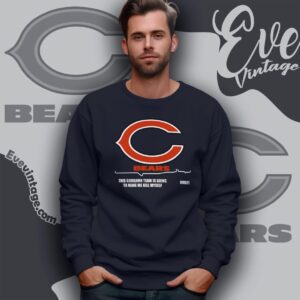
Chicago Bears

Chicago Bears

Chicago Bears
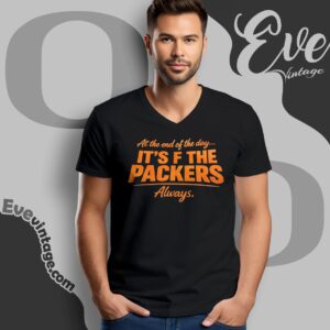
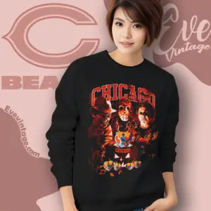
Chicago Bears

Chicago Bears

Chicago Bears

Chicago Bears

Chicago Bears
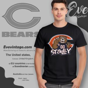
Chicago Bears
Chicago Bears
Chicago Bears
Chicago Bears

Chicago Bears

Chicago Bears

Chicago Bears

Chicago Bears

Chicago Bears

Chicago Bears
Chicago football identity in graphic form
The strongest Chicago Bears designs are readable before every detail comes into focus. Navy and orange establish the team connection, while the C, football equipment, bear imagery, and bold Chicago lettering reinforce it. Some graphics keep that language direct with familiar football symbols and concise slogans. Others use oversized type and central illustrations that feel closer to a stadium poster or old-school sports print.
Chicago itself is another major part of the visual identity. City-name typography and hometown statements connect the team to local pride without requiring a complicated scene. Soldier Field references can add another layer of Bears tradition, but city-forward designs generally remain versatile: the emphasis is on place, colors, and loyalty rather than a particular game or season.
Retro, mascot, and crossover directions
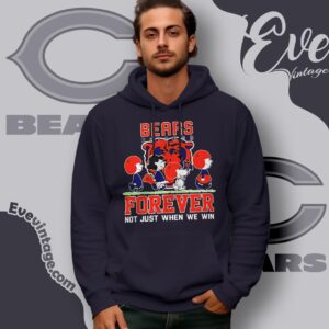
Vintage-style Bears shirts typically rely on distressed ink effects, arched athletic lettering, limited colors, and cartoon-like football figures. A faded finish can make a large illustration feel softer and more nostalgic, while clean block text produces a sharper contemporary look. Bear and mascot concepts bring more movement and personality through charging poses, football scenes, or exaggerated expressions.
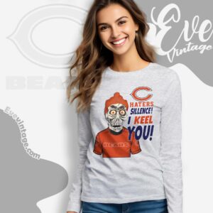
Crossover graphics take a different approach by filtering Chicago football through another visual genre. The observed themes include heavy-metal skull compositions, dancing-bear and rose motifs, comic characters, science-fiction armor, horror treatments, and motorcycle-inspired imagery. In these designs, navy and orange or a Bears-related symbol usually acts as the bridge between subjects. The result is less like a conventional team emblem and more like a conversation graphic built around overlapping interests.
Rivalry humor and seasonal themes
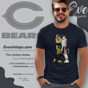
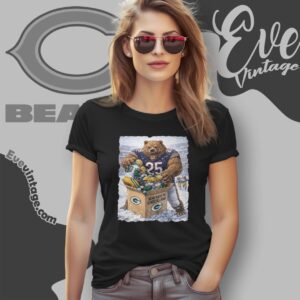
Packers rivalry shirts favor punch lines, caricatures, and game-day taunts over restrained logo treatments. They are intentionally more expressive and specific than general Chicago designs, making the rivalry itself the subject. Evergreen sayings work beyond one result, while references to a particular win, record, or championship are tied to a narrower moment, as seen in the contrast between Chicago and Green Bay Packers rivalry themes.
Holiday graphics adapt the same fan language to Halloween and Christmas. Horror imagery, skeletons, and dark palettes create an October direction; festive characters and winter scenes shift the focus toward December. Across all these styles, the useful distinction is visual priority: team-forward designs lead with Chicago football identity, while crossover, rivalry, and holiday designs lead with a joke, character, or genre and use Bears colors and symbols to complete the connection.