Sabaton
Sabaton
Band identity comes before a single metal look
This parent category is organized by artist, a useful distinction because metal contains contrasting traditions rather than one shared design formula. Among the current branches, Epica and Visions of Atlantis provide symphonic reference points, while In Flames and Testament connect the page to melodic death metal and thrash. Rammstein adds an industrial direction, Sabaton a power-metal one, and Elysion a darker gothic-leaning strand. These are orientation points, not fixed boundaries for the category.
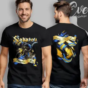
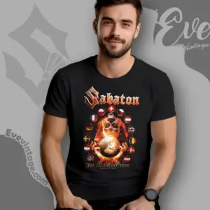
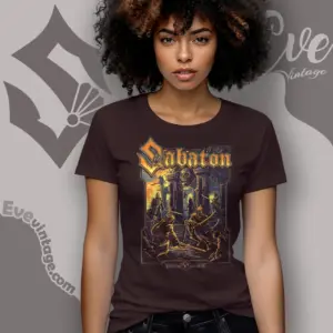
The same contrasts help explain why metal graphics can feel ornate, severe, aggressive, or narrative. Symphonic identity can lend itself to decorative lettering and theatrical compositions, while industrial presentation can favor harder geometry and forceful typography. Thrash and melodic death traditions often point toward sharper forms and greater visual tension. For Sabaton, historical and military subject matter can be as important as the band name. These are design relationships to consider, not claims that every shirt follows one template.
Choosing between emblem and artwork
Start with band identity, then consider what should carry the composition. A logo-led design gives the wordmark or emblem priority and usually reads more directly. Artwork-led designs place the band name within a larger scene, symbol, character, or album-linked composition. Density matters as much as subject: restrained typography creates a cleaner statement, while layered illustration places more emphasis on atmosphere and narrative.
Metal and rock also overlap through prominent logos, music-related imagery, and concert-influenced compositions. Anyone comparing that shared territory can examine rock band T-shirts while using artist and subgenre identity to distinguish the two traditions more precisely.