Rammstein Shirts
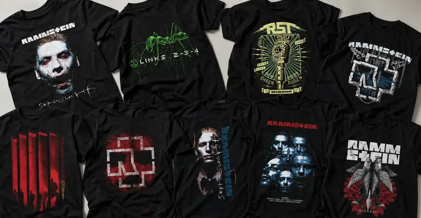
Rammstein shirts translate the German band’s industrial metal identity into stark portraits, song-centered illustrations, angular emblems, and severe geometric compositions. The observed designs range from the close-cropped faces associated with Sehnsucht to graphics referencing “Laichzeit,” “Links 2-3-4,” “Radio,” and “Giftig,” often using black grounds, distressed lettering, restricted color, and hard-edged symbols.
Rammstein
Rammstein
Rammstein
Rammstein
Rammstein
Rammstein
Rammstein
Rammstein
Rammstein
Rammstein
Rammstein
Rammstein
Rammstein
Rammstein
Rammstein
Rammstein
Rammstein
Portraits and the Sehnsucht Visual Language
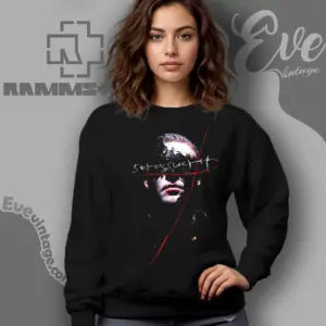
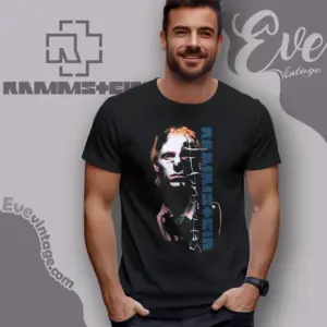
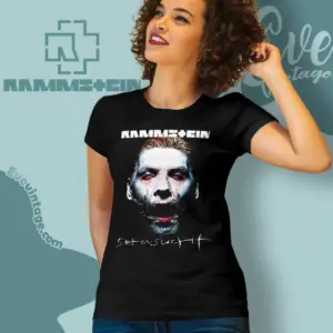
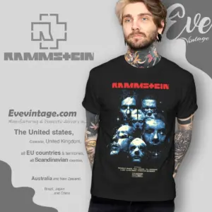
Portrait-led Rammstein shirts make the band members the main point of recognition. The observed Sehnsucht designs isolate individual faces in close crop, pairing pale skin tones and dark shadows with handwritten or vertically arranged lettering. Red marks, blue accents, and irregular lines interrupt the photography, giving the compositions a colder and more confrontational character than a conventional band portrait.
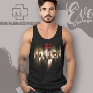
Group designs use the same emphasis on faces differently. Instead of centering one member, they layer several portraits into a dense composition that represents the band as a unit. This creates a useful distinction within the category: individual-member graphics have a focused, poster-like quality, while multi-member imagery carries more visual detail and reads immediately as a full-band design.
Song References as Graphic Concepts
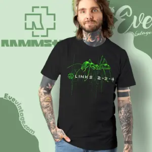
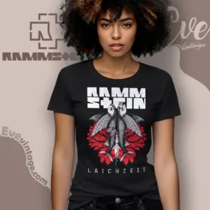
Track-centered shirts allow the subject of a song to guide the image rather than relying on a standard album treatment. “Laichzeit,” from Herzeleid, appears with an insect and red floral forms. “Links 2-3-4,” from Mutter, is represented through a bright green ant and spare digital-looking type. The result is recognizable through the relationship between title and symbol, even when portraits are absent.
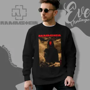
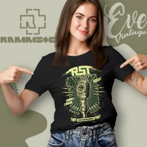
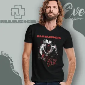
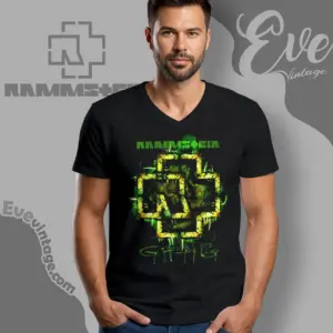
Other observed references extend across later recordings. “Radio” and “Was ich liebe” are associated with the untitled 2019 album, while “Giftig” appears on Zeit. These designs can move from vintage broadcast imagery to figures, silhouettes, or abstract illustration, making song shirts the most varied direction in the collection. They suit an interest in a particular track more than a single recurring band mark.
Emblems, Geometry, and Restricted Color
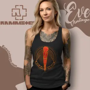
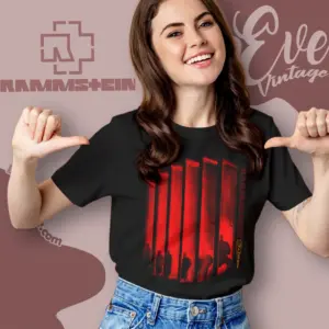
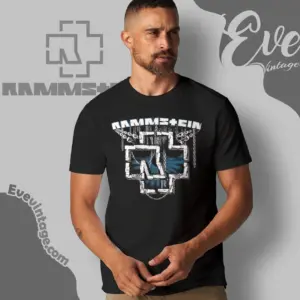
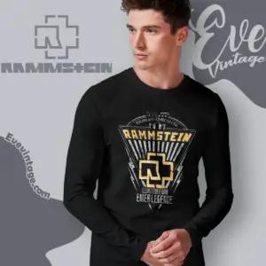
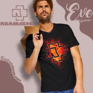
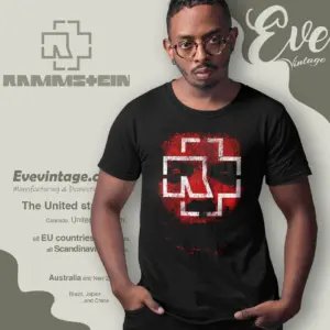
Logo-led designs reduce Rammstein’s visual language to the cross-shaped emblem, angular wordmark, and heavy structural forms. Some place the emblem almost alone against black; others surround it with chains, bars, weathering, or shadowed imagery. Crisp white and red treatments create the strongest contrast, while gray, blue, green, and muted metallic tones produce a more layered or distressed effect.
The main choice is therefore not simply between album and logo graphics. Portraits emphasize a member or era, track references connect words with symbolic illustration, group compositions foreground the full lineup, and emblem designs favor immediate geometric recognition within the broader metal band shirt category. Restrained layouts keep that symbolism clear from a distance, while detailed graphics reward closer attention through texture, secondary lettering, and narrative imagery.