Testament Band Shirts
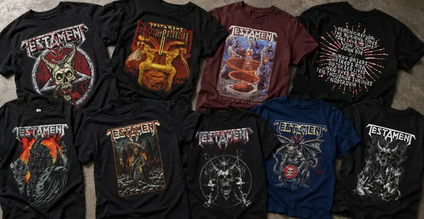
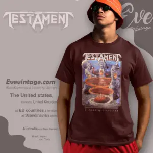
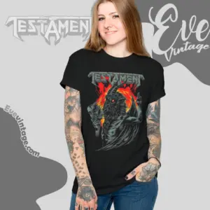
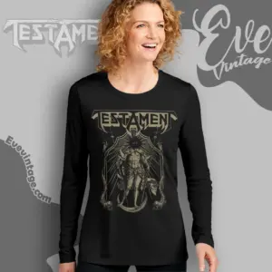
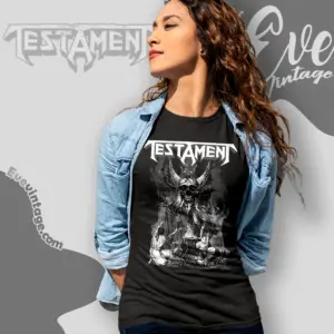
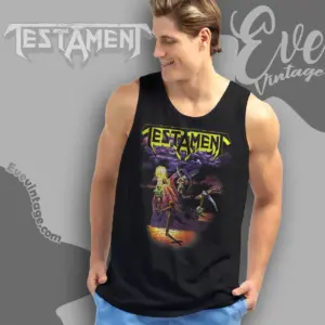
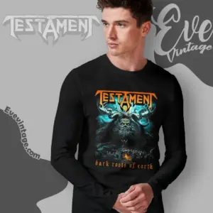
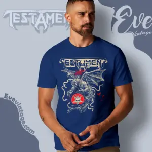
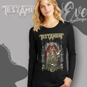
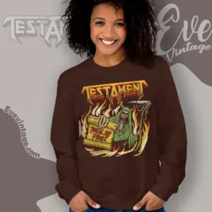
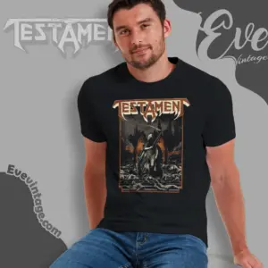
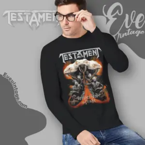
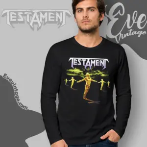
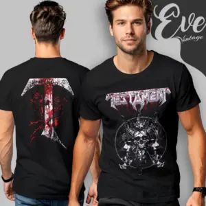
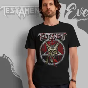
Testament band shirts combine the Bay Area thrash metal band’s angular wordmark with album references and dark illustrated imagery. Designs tied to Practice What You Preach, The Gathering, and Titans of Creation sit alongside skull, reaper, serpent, and ritual-themed graphics. The main distinctions are visual: restrained monochrome linework, compact logo-led emblems, or saturated scenes with the depth and framing of metal poster art.
Testament
Testament
Testament
Testament
Testament
Testament
Testament
Testament
Testament
Testament
Testament
Testament
Testament
Testament
Testament
Testament
Testament


Album references define distinct design directions
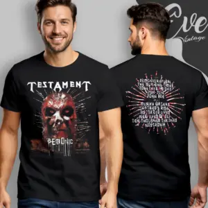
Testament album shirts use a particular record as the graphic’s organizing idea, creating a more specific catalog connection than the band name alone. The observed range includes references to Practice What You Preach, Demonic, The Gathering, Dark Roots of Earth, and Titans of Creation. Across these album-linked designs, the record reference can be paired with either compact imagery or a larger illustrated scene rather than one fixed visual treatment.
When comparing album shirts, consider how clearly the release reference appears and how much of the design is devoted to the surrounding artwork. Some compositions prioritize an immediately readable title or emblem, while others use layered figures and atmospheric detail. Print placement also matters: most observed treatments center on the front, while the sampled Demonic design adds rear text for a front-and-back presentation.
The Testament logo anchors darker illustrated motifs
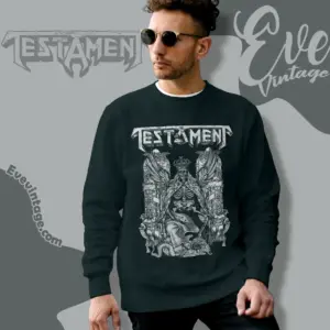
The sharp, angular Testament wordmark is the most consistent identifier across the sampled designs. It commonly appears above or across a central illustration, keeping the band identity visible while the subject beneath it changes. This structure accommodates skulls, reapers, serpents, horned figures, apparitions, winged creatures, and ritual-themed imagery without requiring every shirt to follow the same composition.
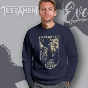
Some graphics compress the artwork into a compact emblem or focus on a single figure, giving the logo and silhouette comparable weight. Others use a tall rectangular field with scenery, multiple characters, or additional background detail. A compact design offers a more direct, logo-led appearance; a larger scene places greater emphasis on the illustration and rewards closer viewing.
Color and composition shape the final look
Monochrome and limited-color Testament graphics rely on linework, texture, and strong contrast. Gray-and-white artwork can produce a restrained treatment, while selective red, gold, or other muted accents can draw attention to the wordmark or central figure without making the full composition highly saturated.
Full-color designs use combinations of red, orange, blue, and purple to separate figures from their backgrounds and create a more poster-like effect, much as other metal band shirts such as Rammstein shirts use color to build a poster-like visual impact. The most useful choice is therefore not simply album design versus logo design. Consider what should command attention first: a particular record reference, the Testament wordmark, a skull or reaper figure, a serpent or winged creature, or the overall color field. Also check whether a front-only composition or an additional back print better suits the amount of artwork you want.