In Flames Shirts
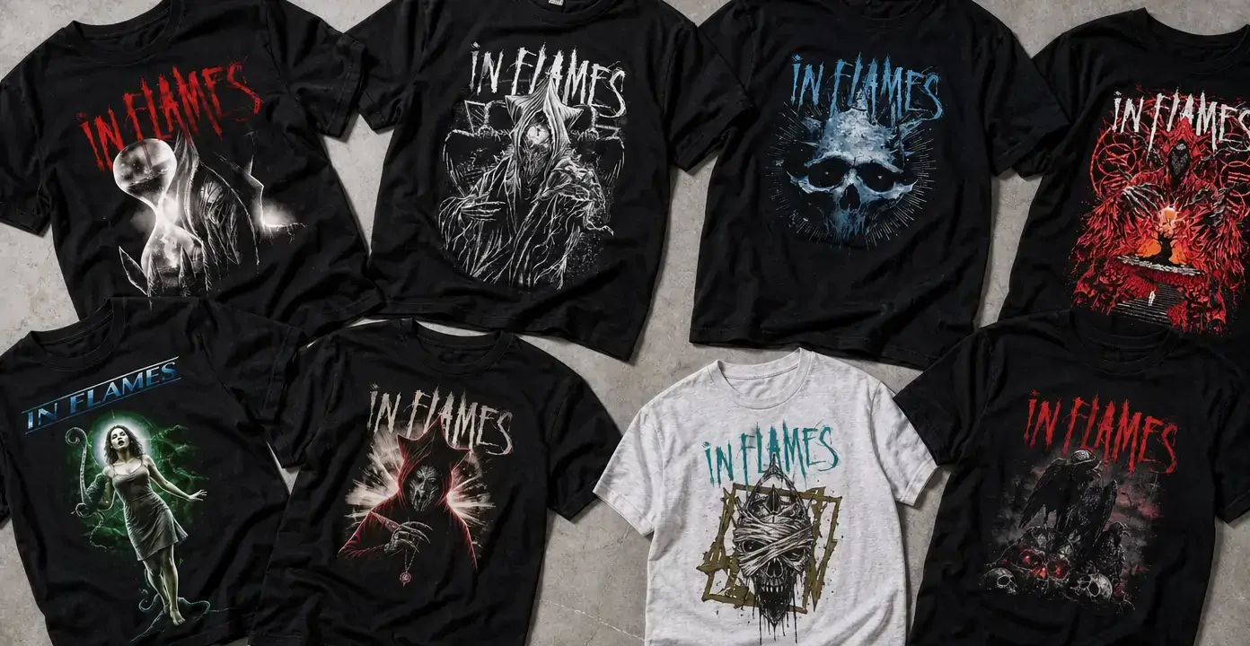
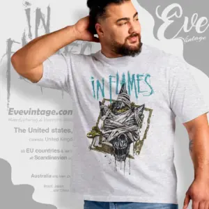
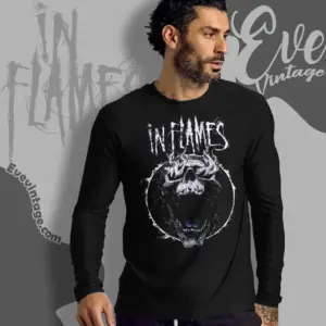
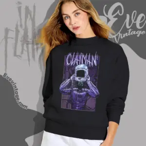
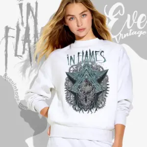
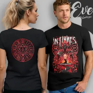
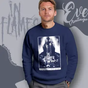
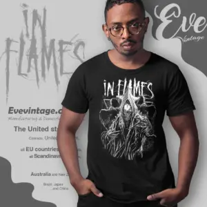
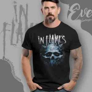
In Flames shirts draw on the Swedish melodic death metal band’s album eras, Jesterhead symbolism, song references, and tour-dated graphics. Designs tied to The Jester Race, Whoracle, and Clayman foreground earlier catalog landmarks, while Foregone provides a later reference point. Across these directions, recurring jester forms, skulls, time imagery, and distressed lettering offer alternatives to straightforward album artwork.
In Flames

In Flames
In Flames
In Flames
In Flames
In Flames
In Flames
In Flames
In Flames
In Flames
In Flames
In Flames
In Flames
In Flames
In Flames
In Flames
In Flames
In Flames
In Flames
In Flames
In Flames
In Flames
In Flames
In Flames
In Flames
In Flames
In Flames
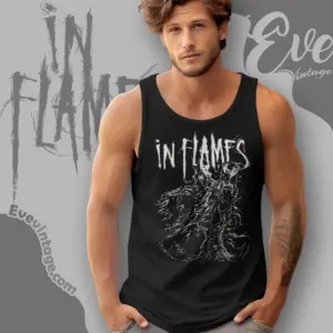
In Flames
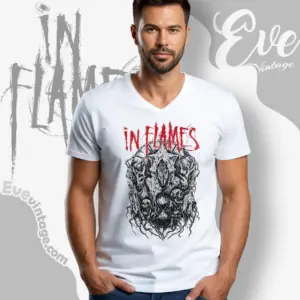
In Flames
Release References from Earlier Albums to Foregone
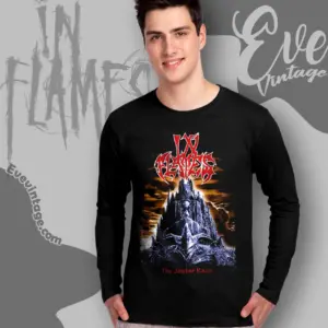
Album-linked graphics place a specific In Flames release at the center of the design. The Jester Race, Whoracle, and Clayman represent earlier points in the catalog, while Foregone provides a later reference. This distinguishes shirts rooted in a particular record from graphics built around the band’s broader visual identity.
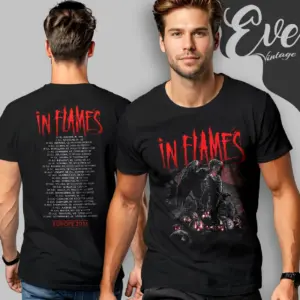
Song references narrow that connection further. Designs associated with “Meet Your Maker” and “The Great Deceiver” point to individual tracks from Foregone rather than the album as a whole. Tour-dated artwork works differently again, marking a particular live run instead of a studio release. These references carry more time-specific context than a recurring logo or symbol.
How Jester and Time Imagery Changes the Graphic
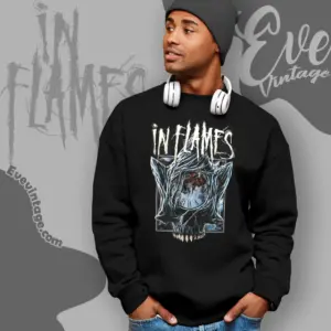
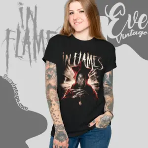
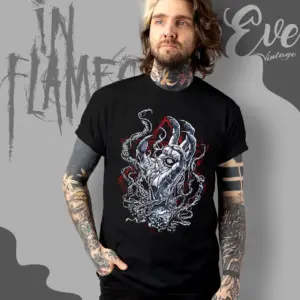
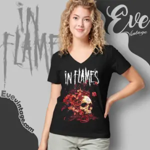
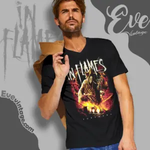
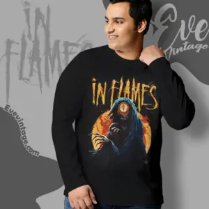
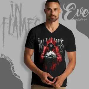
The Jesterhead is an enduring In Flames identifier, but it does not require one fixed composition. In the sampled designs, jester forms are paired with skulls, frozen surfaces, dripping treatments, mechanical detail, and clock-related imagery. These variations keep the band reference recognizable while changing the mood and visual density of the shirt.
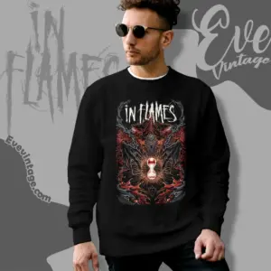
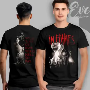
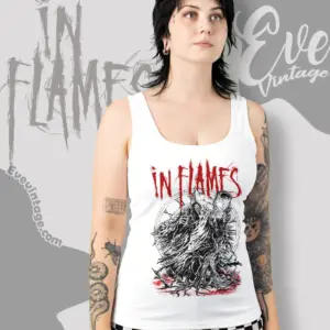
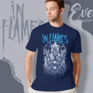
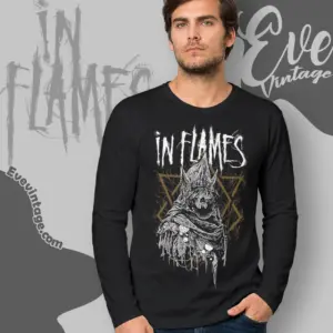
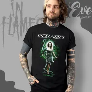
Other observed graphics use hourglasses, skeletal forms, hooded figures, organic linework, and symmetrical fantasy imagery. Most place a large illustration beneath or around the In Flames wordmark. Dark garment backgrounds give white linework and selective red, blue, green, or flame-toned accents greater contrast. A lighter garment can reverse that effect, allowing dark linework and muted mechanical details to carry the composition.
Choosing Between Album, Symbol, Song, and Tour Graphics
An album-focused shirt makes the release the main point of recognition. Jesterhead and logo-led designs communicate a wider connection to In Flames without centering one record, while song graphics favor a narrower title reference. Tour-dated designs carry the clearest event-specific context.
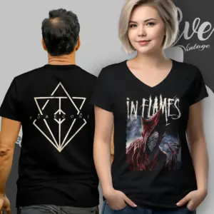
Composition creates another useful distinction. A large front print establishes an immediate focal point, particularly when the wordmark sits above a skull, figure, or emblem. Some two-sided designs add typography or supporting artwork on the back, giving tour information or an extended illustration its own space. Line-heavy monochrome artwork tends to emphasize detail, while limited red, blue, or green accents create a sharper focal contrast.