California Tiki Bar Shirts
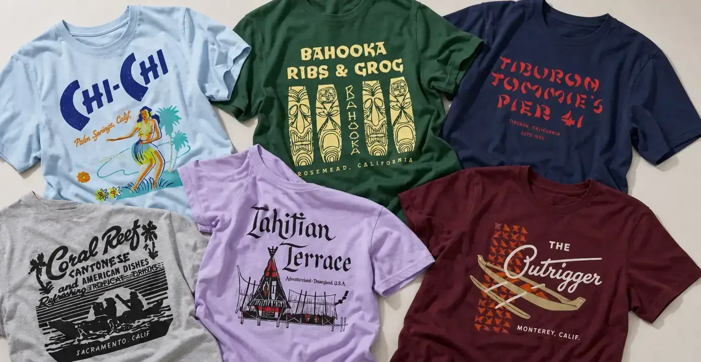
California tiki bar shirts pair venue-style names and city references with midcentury-inspired lettering, tropical illustration, architectural sketches, and cocktail-lounge graphics. The designs span destinations associated with Los Angeles, Long Beach, San Francisco, Sacramento, San Diego, Palm Springs, Anaheim, and other California communities, ranging from restrained logo treatments to colorful scenes built around palms, outriggers, masks, and waterfront imagery.
California Tiki Bars
California Tiki Bars
California Tiki Bars
California Tiki Bars
California Tiki Bars
California Tiki Bars
California Tiki Bars
California Tiki Bars
California Tiki Bars
California Tiki Bars
California Tiki Bars
California Tiki Bars
California Tiki Bars
California Tiki Bars
California Tiki Bars
California Tiki Bars
California Tiki Bars
California Tiki Bars
California Tiki Bars
California Tiki Bars
California Tiki Bars
California Tiki Bars
California Tiki Bars
California Tiki Bars
California Tiki Bars
California Tiki Bars
California Tiki Bars
California Tiki Bars
California Tiki Bars
California Tiki Bars
California places in tropical-lounge graphics
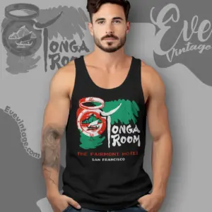
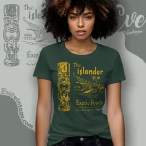
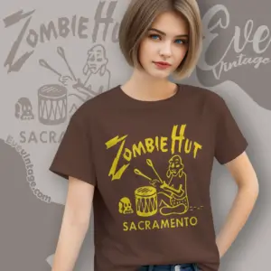
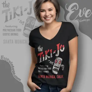
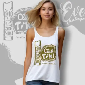
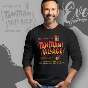
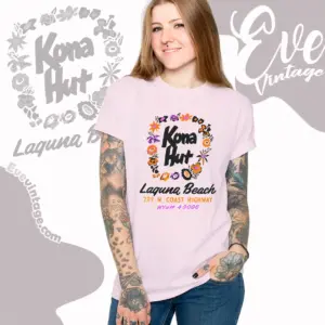
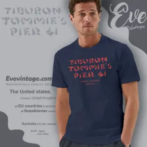
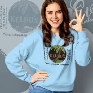
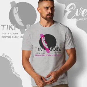
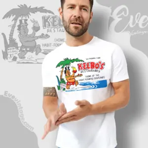
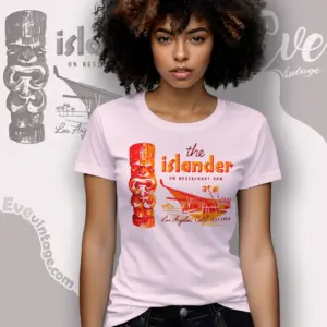
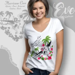
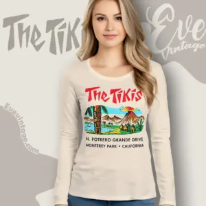
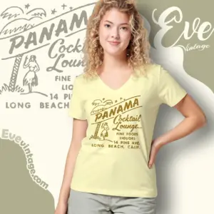
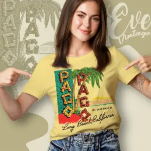
Place is one of the clearest organizing ideas in this category. Los Angeles and Long Beach references include names such as Kelbo’s, The Islander, Pago Pago, Leilani Hut, and Panama Cocktail Lounge, alongside the state’s related California dive bar shirts. Northern California appears through San Francisco’s Tonga Room and Tiki Bob’s, Sacramento designs such as Coral Reef and Zombie Hut, and a Tiburon Tommie’s Pier 41 graphic. Other shirts connect the tropical-lounge theme with Anaheim, Beverly Hills, Catalina Island, Downey, Laguna Beach, Modesto, Monterey Park, Newport Beach, Palm Springs, Rosemead, and San Diego.
Those city lines can be a quiet caption beneath the main name or an important part of the composition. A location-forward design suits someone interested in a particular California community, while a large venue name makes the bar or restaurant identity the visual focus. These references should be read as subjects of the artwork, not claims that a venue is currently operating or affiliated with the apparel.
From restrained lettering to illustrated escapism
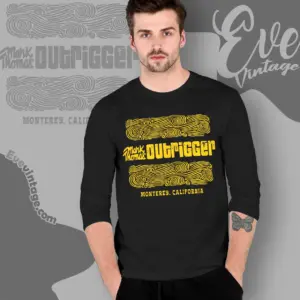
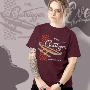
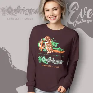
California tiki bar tees do not share one fixed graphic formula. Some use little more than expressive lettering and a small location line. Tiburon Tommie’s Pier 41, for example, is represented with stencil-like red type on a dark field, while The Outrigger combines script lettering, geometric ornament, and crossed outrigger forms. This simpler direction emphasizes silhouette, spacing, and period-inspired typography.
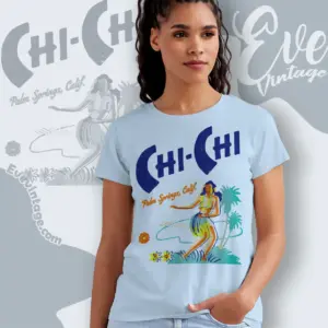
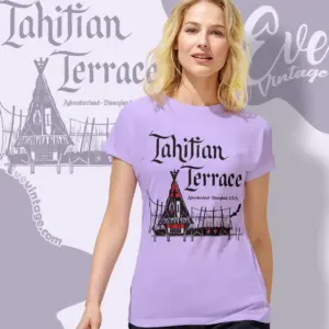
More illustrative designs build a complete lounge atmosphere. The Chi-Chi graphic combines oversized lettering with a colorful figure, palms, flowers, and a loose scenic background. Coral Reef uses a monochrome restaurant-ad layout with palms, horizontal lines, and a waterfront scene. Tahitian Terrace centers an architectural sketch beneath dramatic blackletter-style type. Bahooka Ribs & Grog takes another route, arranging repeated carved-face motifs around the venue name.
Choosing a visual direction
- Typography-led: Large scripts, stencils, or display lettering keep the venue name dominant and the composition relatively spare.
- Architectural: Building sketches, rooflines, terraces, and entrance imagery emphasize the imagined setting.
- Scenic: Palms, water, flowers, boats, and figures create a fuller tropical-lounge tableau.
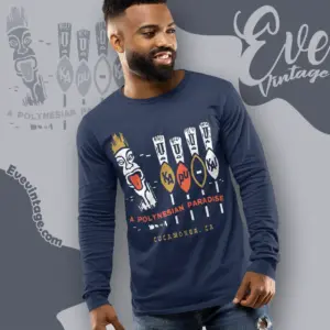
- Emblematic: Masks, outriggers, geometric patterns, and compact symbols produce a bolder badge-like graphic.
Color changes the effect as much as subject matter. Limited cream, black, or red printing feels closer to an old sign or restaurant advertisement, while turquoise, orange, yellow, and green support a brighter resort aesthetic. Together, venue name, California location, illustration density, and palette provide more useful distinctions than treating every tiki graphic as the same style.