Beer Shirts
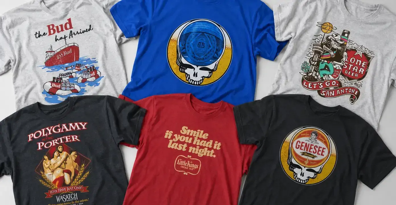
Beer shirts turn brewery names, label-style lettering, tavern humor, and regional pride into wearable graphics. The observed designs range from restrained vintage logos and slogan-led cream ale prints to elaborate porter illustrations, Texas-themed scenes, and Grateful Dead–influenced Steal Your Face compositions, giving the category both nostalgic and boldly graphic directions.


From beer labels to wearable graphics
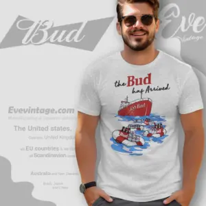
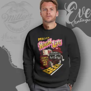
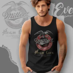
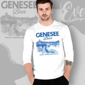
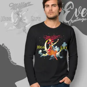
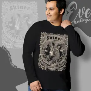
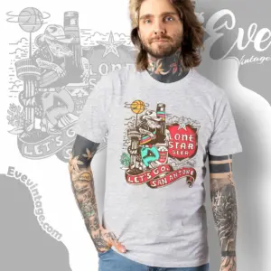
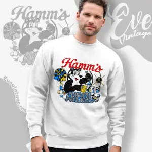
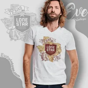
Beer shirt designs often use the visual language of brewery branding and vintage advertising. A simple composition may center a brewery name in prominent lettering, while a more elaborate design can frame that identity with banners, grain, bottles, illustrated figures, or a full narrative scene. Bud, Miller High Life, Little Kings, Genesee, Lone Star, Shiner, Hamm’s, and Wasatch show several distinct approaches within that broader category.
“Vintage” here describes the look of the artwork rather than the confirmed age of the garment. Faded treatments, compact label shapes, hand-drawn lettering, limited palettes, and advertising-style slogans can create a retro effect. These designs suit shoppers who prefer the direct recognition of a beer logo or brewery name without the visual density of a large illustration.
Regional identity, humor, and beer styles
Some beer graphics carry a strong sense of place. Texas imagery, a San Antonio slogan, Rochester wording, or another brewery-specific reference can connect a design to a city or region rather than beer culture in general. That emphasis may appear through maps, stars, local wording, illustrated characters, or narrative scenes. It offers a useful distinction between a broadly recognizable brewery graphic and one centered on regional pride.
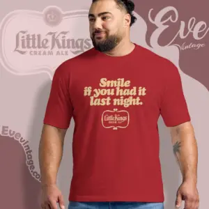
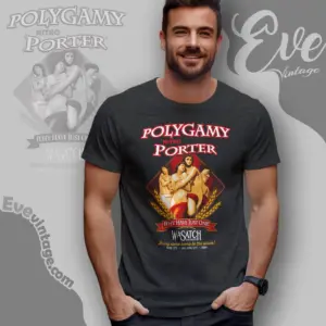
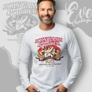
Humor provides another direction. A line such as “Smile if you had it last night” recalls slogan-driven bar advertising, while the Polygamy Porter name supports visual wordplay. Beer-style names also help distinguish the subjects represented across the category, including cream ale, bock, porter, and nitro porter. In these shirts, the style name may function as part of the label typography, slogan, or central emblem, creating overlap with funny bar tees rather than offering beverage guidance.
Choosing a composition
For a quieter beer shirt, consider simple lettering, a compact label treatment, or a centered brewery mark. Illustrated scenes make a stronger statement through figures, regional symbols, sports references, or ornamental framing. Circular emblems offer another option, particularly in crossover graphics that combine beer branding with recognizable music imagery such as the Grateful Dead’s Steal Your Face motif. This describes a visual combination, not an established collaboration.
The most useful choice is not only which beer name appears, but how that identity is presented: clean logo, aged advertisement, humorous slogan, regional scene, or music crossover. Each direction creates a different effect, ranging from understated nostalgia to bold, referential artwork.